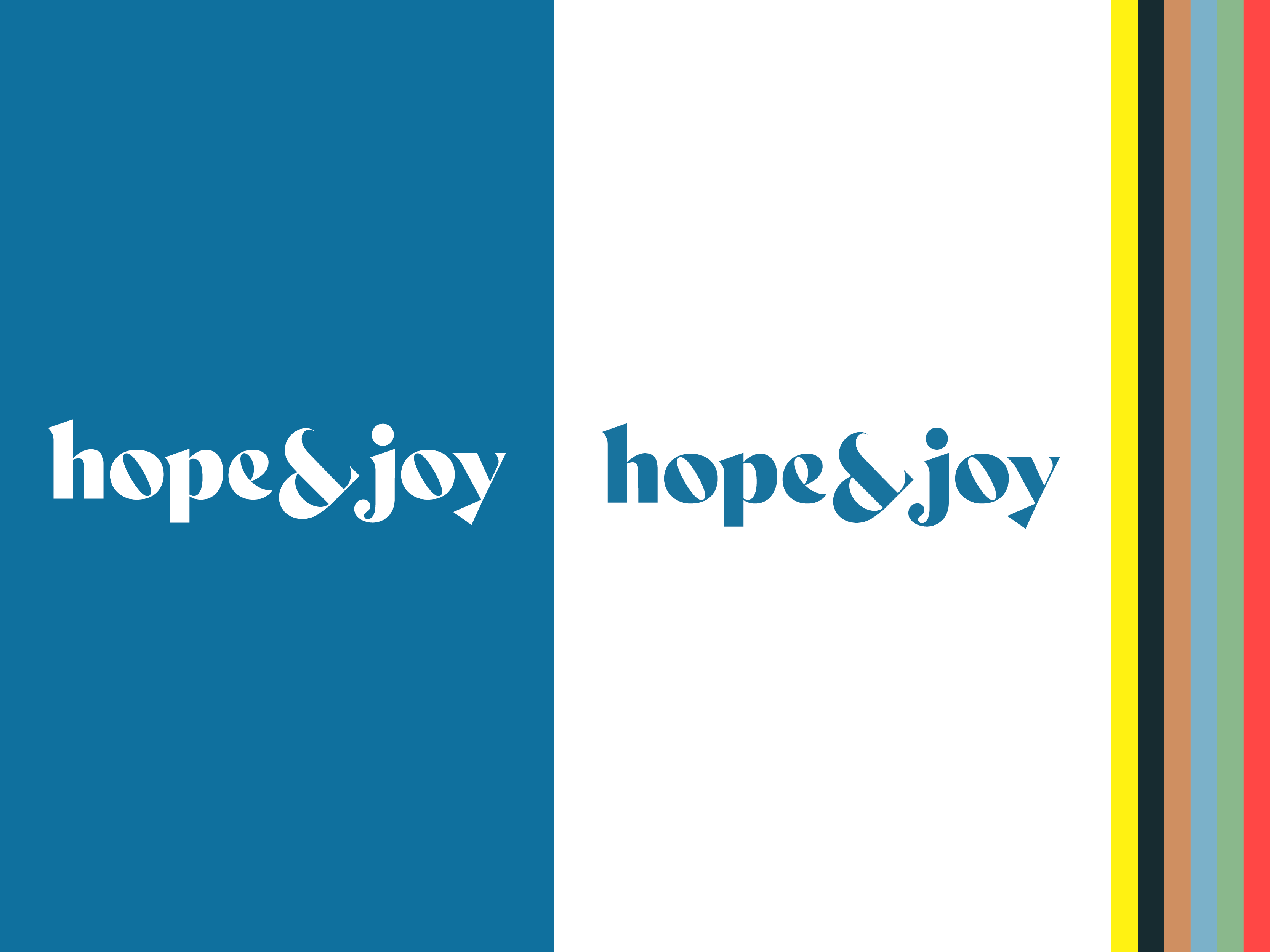
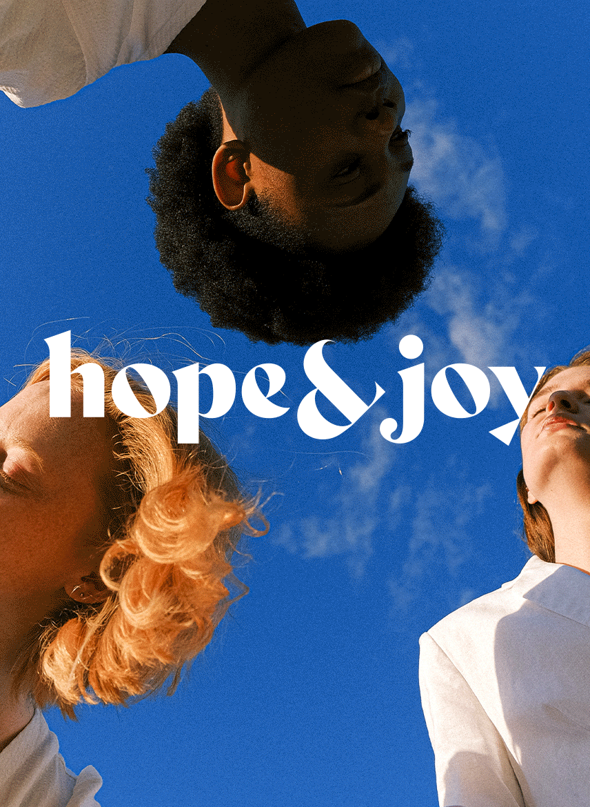
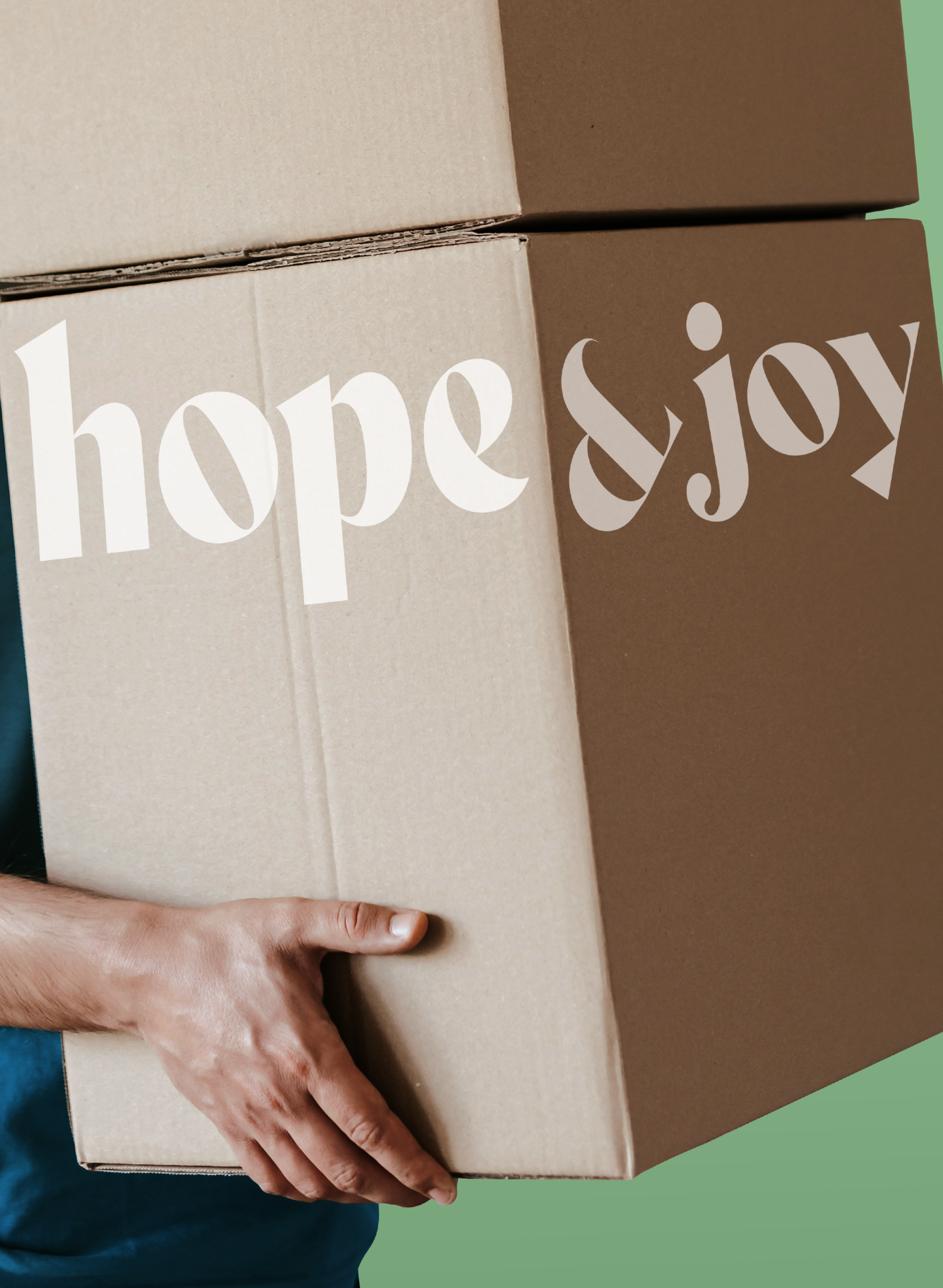
Hope&Joy
Delivered
Brand Structure
Visual Audit
Visual Identity
Illustration
Website design
Package design
Brand Structure
Visual Audit
Visual Identity
Illustration
Website design
Package design
Collaboration
3D design with
JM Design
3D design with
JM Design
We support your love, hope&joy and your healthy lifestyle! – Life Essentials
Challenge
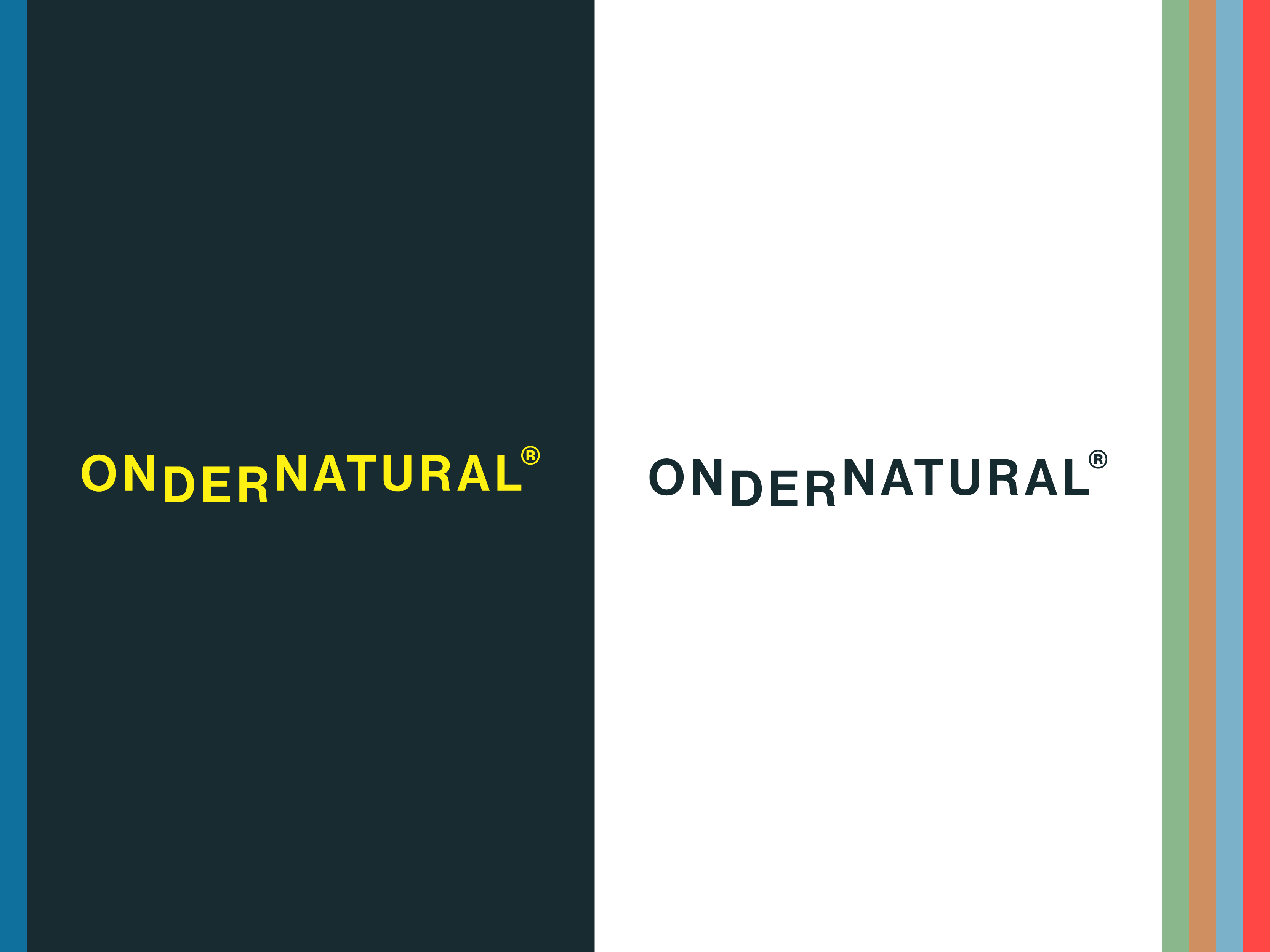
hope&joy is a start-up intimate company in Korea. They used to be the B2B name for the intimate brand called OnderNatural®. The client looked for an umbrella brand to stretch a range of healthy life cycle brands for everyone; OnderNatural®(Intimate brand) and Baven®(baby planning brand).
Connecting to all generations!
Their hope&joy symbol represents a symbol of ‘love’ and ‘and’ to link our life from youth to old age.
hope&joy is a mother brand for connecting intimate&family planning brands to the life cycle(OnderNatural® and Baven®) for everyone.
A brand colour palette set is able to cross all over the brands!
hope&joy has 7 different colours. Their primary, secondary colours and colour propositions from their colour palette are able toconnects to sub-brands distinguishing each brand while embracing a distinctive visual style.


hopd&joy’s brand overview
 ONDERNATURAL®
 Baven®
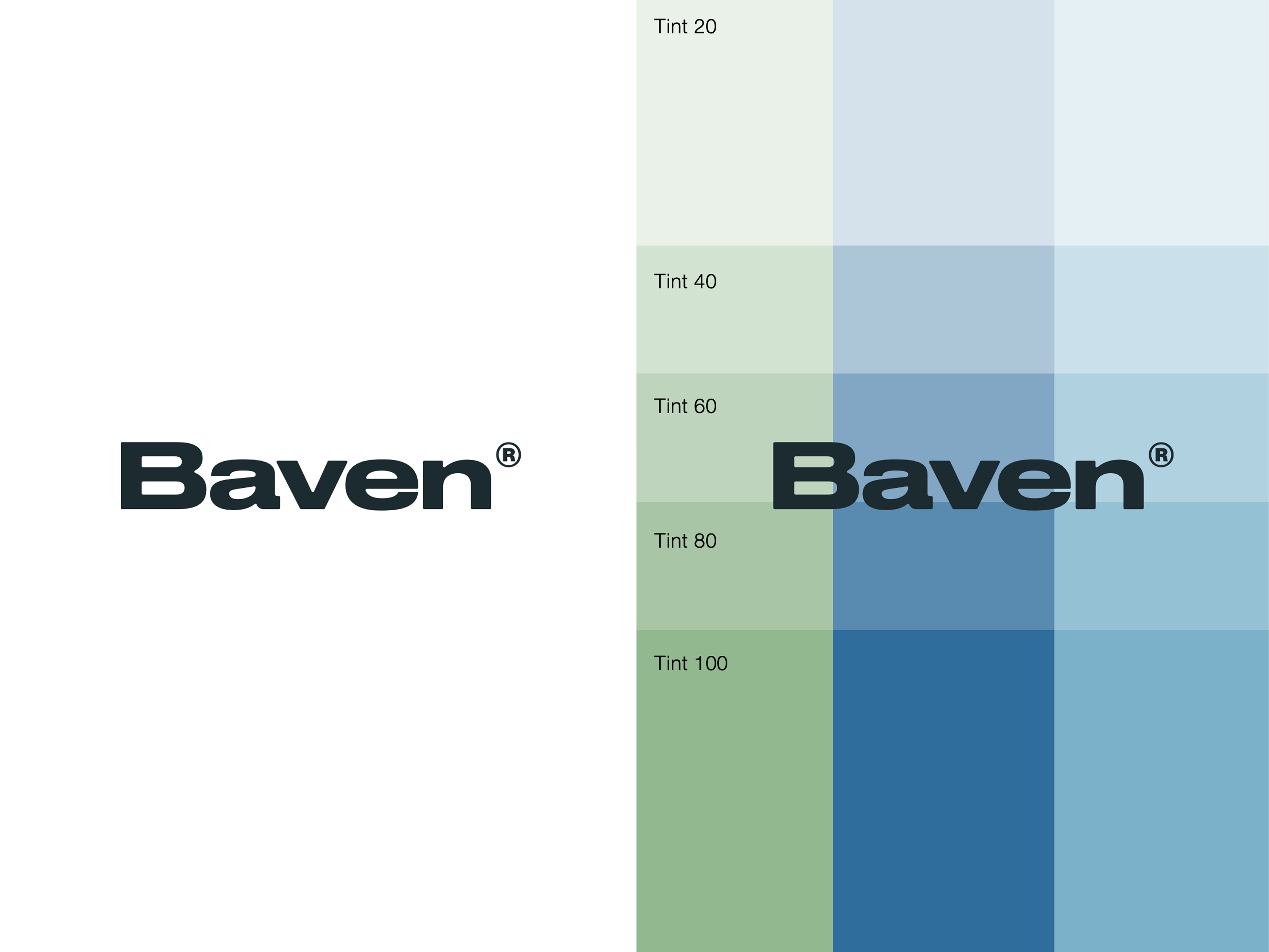
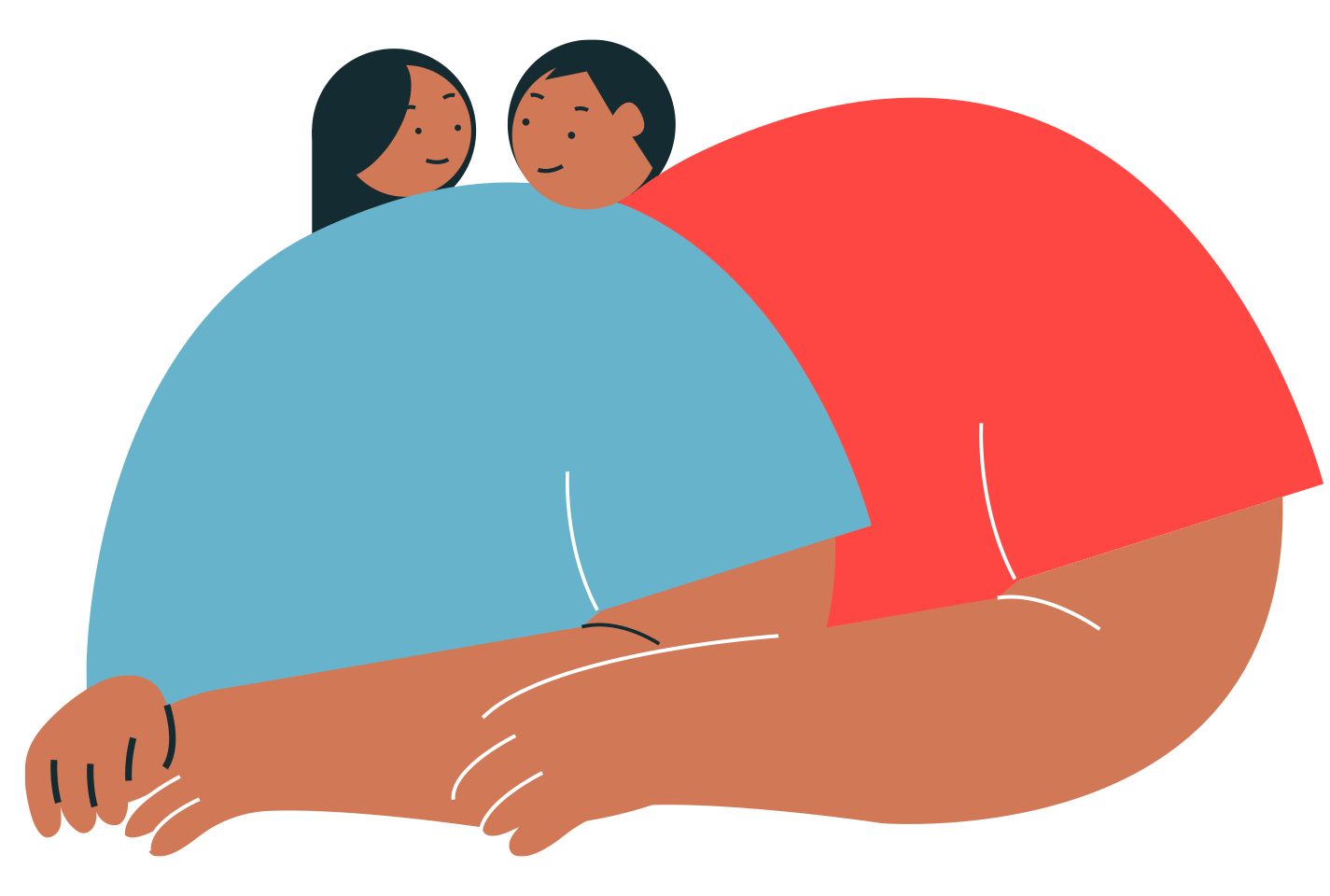
Illustration System
The illustration system visualises hope&joys’ target audiences in a friendly way for both young professional and family lifestyles. Also, the founders and their team illustration gives an opportunity to introduce their team to their audience at a relaxed and personal level.


 OnderNatural®
Say hey to collborate together! hijihyelee@gmail.com
© Jihye Lee 2024