Delivery
Visual IdentityWebsite Design
Package Design
Art Direction
OnderNatural®
Don’t hide anymore!
Intimate Essentials
2020
The intimate industry in South Korea is getting more open and becoming one of the important sectors in lifestyle. However, it still tends to be an embarrassing topic to discuss. OnderNatural® mixes On+Under+Natural to mean ‘Brings intimacy from the shadow to everyday bright life’ and the brand launched with an intimate cleansing spray. They were looking for re-branding supports a healthy intimate lifesytle.


Intimate Essentials!
We reflected the ‘bring intimacy from the shadow to everyday bright life’ idea through our brand identity.
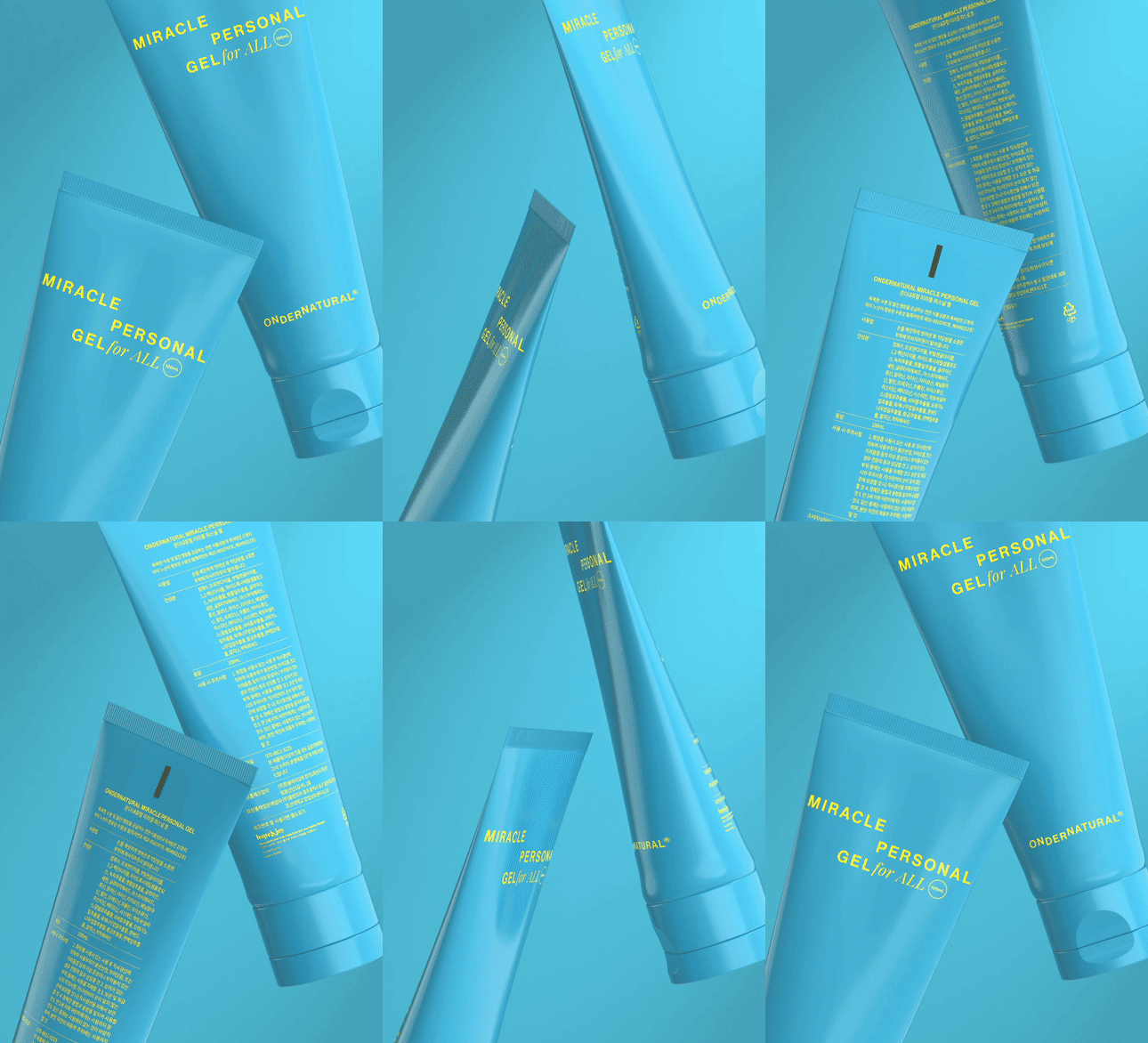
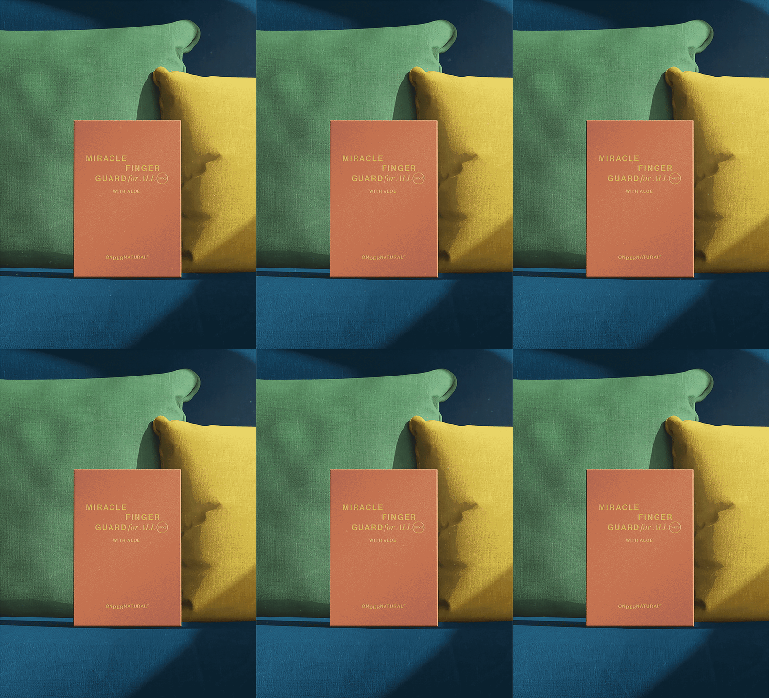
OnderNatural® masterlogo is visually shown moving up and down to represent its meaning and rhythm (under and natural). Also, using bright yellow is a positive guidance. The products are displayed in our everyday spaces.
Bring bright and optimistic energy into our brand system
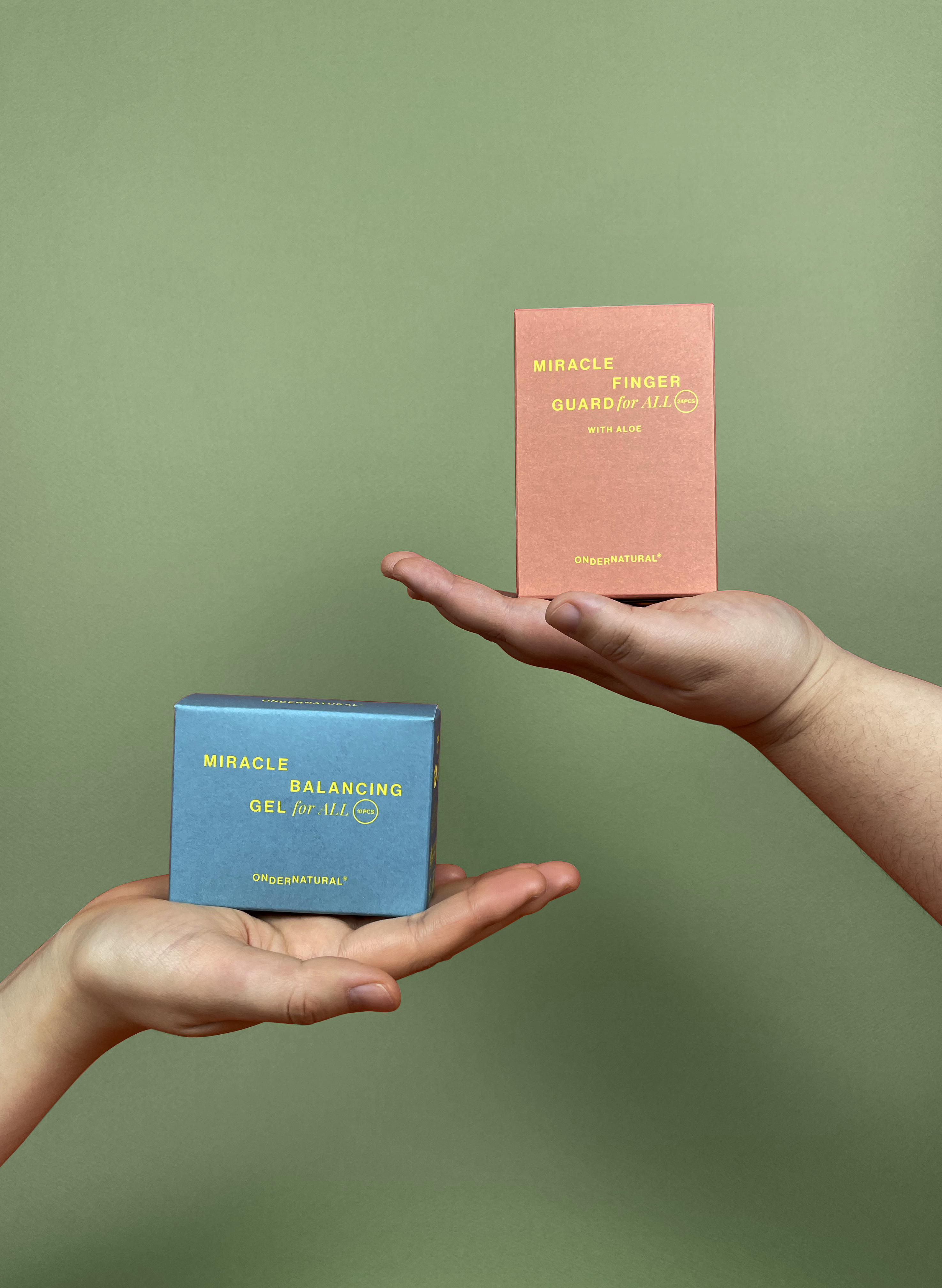
OnderNatural® package label system represents product names with rhythm and creates a cohesive brand idea vistually. On the left side from the centre it shows its products’ function and on the right it shows key product name, target and weight.

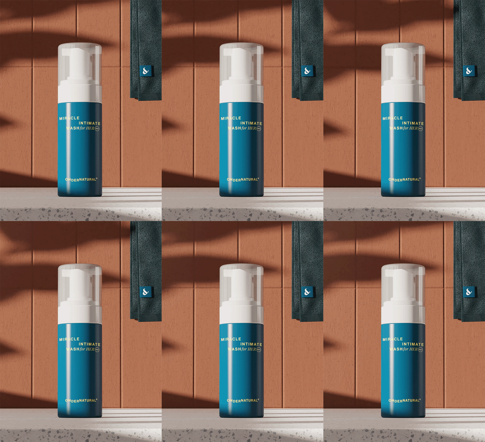
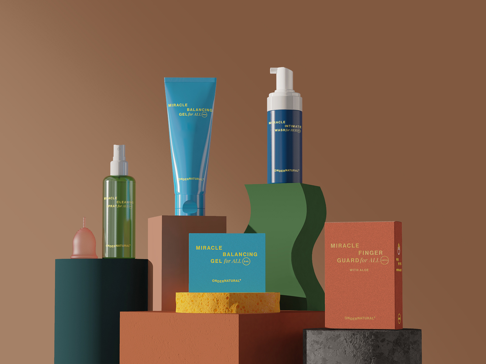
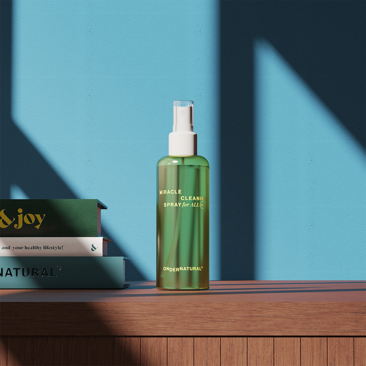
In our everyday life
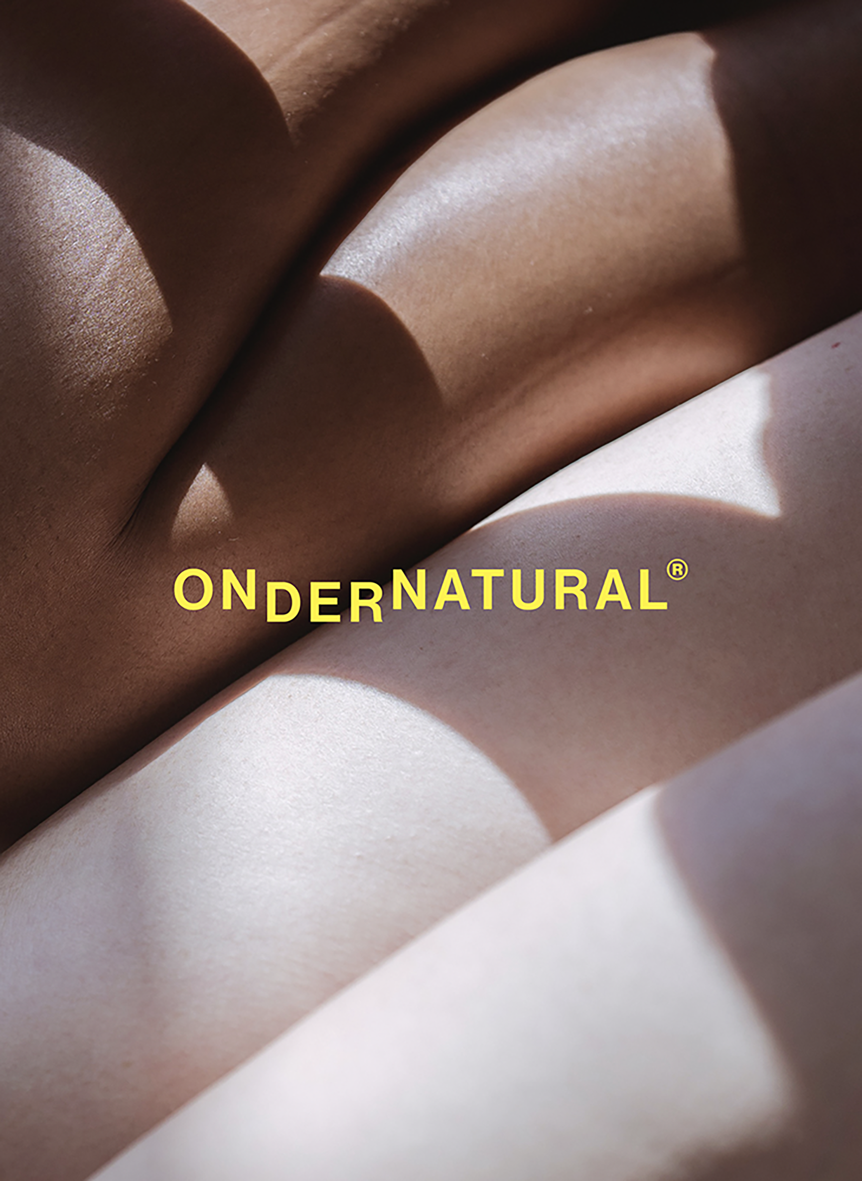
OnderNatural® products appear in our everyday life to tell our audience that they don't need to hide. Also, adding sunshine, shadow and dust with a little motion enhances everyday moments. Also, it will give them a warmer and more friendly feeling by showing the diversity of our target audience with different shapes and skin colors with the products.

